TEAM
DELIVERABLES
Jeffrey
Kyle
Website
Product Photos
Photo Edits
Sitemap
Brand Guide
Print Deliverables
Visual Design
Creative Design
Behind Starry Candle
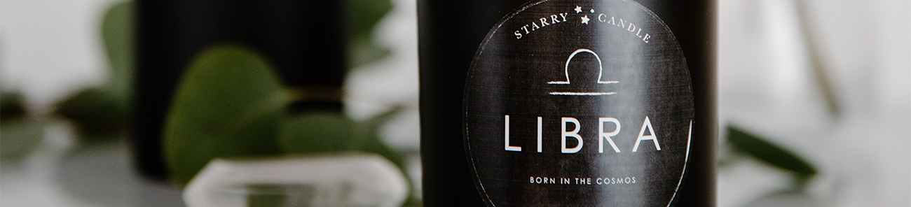
Starry Candle is a horoscope-based subscription company that has new candle scents each month specifically tailored to you, based on your astrological sign. The candle also comes with a personalized horoscope for the month that includes details about your sign.
ROLE
UX/ UI Designer
Marketing
DURATION
Three Months
TOOLS
Adobe Creative Suite, Illustrator, Photoshop, InDesign,
CLIENT
Jeffrey Spiegel
PROBLEM
This project was freelance, he reached out to me, to help him design his website. The problem at hand was that this company was in the early development stages, and therefore, needed help with packaging, marketing, as well as developing an entire website.
SOLUTION
Initially, there were client meetings once a week to flush out ideas and website organization. I started with a sitemap and layouts of what I believed he wanted from his website. After looking over these, he realized that he didn't have as clear of an idea as he had thought. We now had to re-evaluate his needs and determine what he actually wanted for his website and brand. After this, we took a deep dive into what he wanted the website experience to be like for his shoppers, which led to the current design.
RESPONSIBILITIES
Since I was the only designer on the team, I had to take the time to explain the different aspects of the website, and how it would make sense for the user. Each week we would have a call to talk about the progress from the week before. As the project grew, so did his trust in me as a designer, and my responsibilities grew. I began with the website, then packaging materials, the candle label, and marketing for social media.
RESEARCH & CLIENT MEETINGS
After the first client meeting, it was evident that the client wanted their website to be a unique experience for the user. I had to look into astrology and horoscopes to better determine the feel, but ultimately I was able to portray what he wanted the website to feel like. In the second client meeting, I had to explain that the initial, simple, layout that the client wanted, wouldn't support all the features he wanted on the website. I laid it out so it was easy to understand, and it left him in awe of my research, preparation, and knowledge. This built up his trust for me as a designer, and led to us working well together throughout the whole process.
DEFINING THE GOAL
After initial research and client meetings, we were able to determine the goal of the website:
For the website to be an experience that allows the user to understand the brand through the design.
Although, this goal did change.
WEBSITE DEVELOPMENT
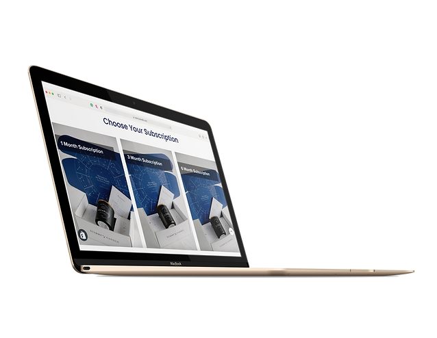
This process started with many sketches. Sketches of a site map to organize all of the possible menu options, sketches of page layouts, and sketches of everything in between. I then translated this all to the computer to present to the client. The first site map is what the client said he wanted, and the second includes options that I think would be beneficial for his site that he hadn't thought of before. He explained he wanted to do his site through Shopify, and I then looked into Shopify's capabilities to match his needs.


NEXT STEP
After looking through all of the options and narrowing down on what would be practical, we then moved onto layouts. I laid out the essential pages of the site for further discussion and review. I also developed a brand guide so I could have all of the design elements in one place for convenience when designing.


FIRST ATTEMPT
This was the initial layout, we wanted to include a section for the user to select their birthday and find out their horoscope. We determined that the wheel wouldn't work, so we revised and added individual horoscope buttons, and here is the fleshed-out, first version of the website.


REDESIGN
After looking back at the goal we had made, and speaking about it, our team decided to redesign our goal and the site. The initial goal of creating an experience had changed, the client now wanted an easy, simple, one-page site, so the user would be able to see the product with the least amount of clicks possible. This created new challenges and a redesign.
Current Site
Here is the final outcome. We added a purchasing option on the home page, as well as a photo of the product in the hero image to make it clear what the product was.


REFLECTION
This project was intimidating starting from almost nothing. There were so many possibilities available for the website, but taking into account user patterns, design aesthetics, and more, we were able to determine what the best combination would be to intrigue users while hoping they understand the brand and product.
The biggest lesson I learned was to present all options to a client, because it is ultimately their decision, and it will open doors for them and their brand. I also learned that it's ok if they decide they want to change their idea, it doesn't mean that the first one was designed poorly, it just means there is room for constant improvement, which is normal.


